UX/UI Design (2021)
ShipStation Design System & Resource Hub
About ShipStation
ShipStation is a global online shipping platform and mobile application that allows online retailers to manage small parcel shipping and ecommerce fulfillment. The Austin-based company combines order processing, shipping label production, and customer communication that easily integrates with major carriers and online platforms. ShipStation is owned by Stamps.com, and is part of the Auctane family (comprised of ShipStation, ShippingEasy, ShipEngine and ShipWorks).
Creating a Design System
Evaluating the ShipStation Marketing Website
I joined the ShipStation marketing team in November 2019, when ShippingEasy merged with the greater Auctane family. At that point, ShipStation had an established brand identity with a visually underwhelming — yet high-performing — website. Despite upwardly trending results, the consensus was clear across the organization: ShipStation needed a redesign.
Before moving forward, however, we needed to finalize ShipStation’s brand guidelines and get approval from our Product team, as well as executive leadership.
Creating a Design System
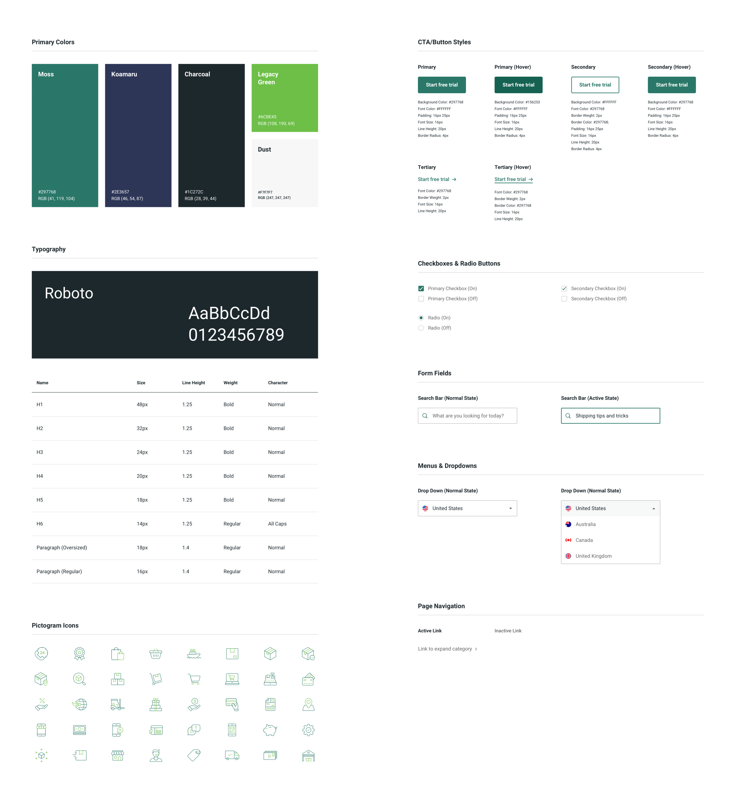
Despite its brand guidelines, ShipStation needed a design system to structure its marketing website. We created a simple, easy-to-use framework to guide future pages and maintain consistency across the site.
Resource Hub (Desktop)
ShipStation produces a lot of content, and they do so for good reason: to generate leads. Content pieces — like ebooks, blogs, infographics, and case studies — are a driving force in SEO. Our data confirmed that users who engage with multiple pieces of content are more likely to sign up — yet we weren’t taking advantage of this opportunity.
Aside from the blog, ShipStation lacked a centralized location for its content. With a Resource Hub, we reasoned that grouping content and providing relevant suggestions would better engage prospective customers — thereby increasing the likelihood of their sign up.
So, where to begin?
Right away, we broke our content into 4 categories: Ebooks & Guides, User Stories, Case Studies, and Videos. From there, we established a loose wireframe.

Initial Wireframe
This is supposed to be more of a sketch than a low-fidelity mockup, but because my sketches look absolutely terrible… this was a much safer alternative for gathering initial feedback.
Marketing team leaders expressed a few concerns, including:
Is there a way to prioritize content on the page? Can we have our more important pieces of content display first?
Solution: Including a “Featured Resource” at the top of the page (similar to our blog)
Can we add multiple featured resources? How can we achieve this without overwhelming the page?
For user testing, we relied on individuals outside of the organization, who mentioned the following:
Lot of scrolling… is there a way to jump to content types?
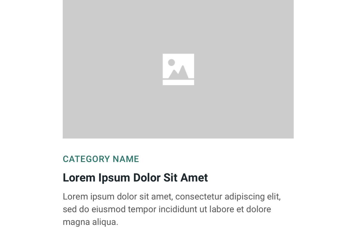
Reusable Components
This was undoubtedly one of the most valuable outcomes of this project. The content “cards” became a core part of ShipStation’s design system, easing the future burden for our web developers.
Where else can we reuse this component?

Resource Hub Homepage (Desktop)
This structure is also guiding our Q2 blog redesign, which will also reuse these components.

Individual Resource Pages: Recommended Content (Desktop)
This example is just for user stories, but it also applies to all other content types — as well as our future blog pages. In every scenario, users will receive relevant content recommendations.

Resource Hub Homepage (Desktop)
The flexibility of the component means that it can be easily scaled for device width.
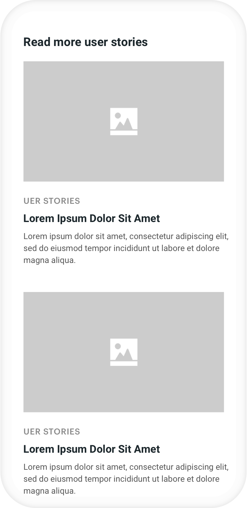
Individual Resource Pages: Recommended Content (Desktop)
High-Fidelity Mockups
Once we got a better sense of user needs — as well as the Marketing team’s objectives — we moved on to a high-fidelity prototype featuring existing content from the site.

Desktop Main Page: Key Features
Page Navigation
This bit of user feedback was enormously helpful — as we ultimately opted for the tabbed navigation bar at the top of the page. This helps users avoid unnecessary scrolling (particularly if we add more types of content) and improves the overall user experience.
Featured Content
Our current design only allows for one piece of featured content. We considered allowing users to feature multiple, but feared that more than one large “card” would overwhelm the page and require unnecessary scrolling.

Content Category Page: Key Features
When the user clicks on a category shown at the top of the page, he or she will jump to their selected section via an anchor link. However, when the user clicks on “See all case studies” (or other type of content), he or she will be redirected to that individual page (shown above).
Mobile Experience
In the animation below, you’ll notice that — unlike on the partner listing hub — the categories are listed under a drop down menu. Our reasoning was that the page was easy enough to navigate as is, and is a “nice to have” option that shouldn’t take up valuable vertical space.
Additionally, you’ll notice that only one piece of content is shown for each category. This was intentional, as we know our mobile users rarely scroll far. By limiting the quantity of content, the page length would be shorter and perhaps more manageable for the user.


Moving Forward
What we’re testing:
User engagement: Specifically — are users engaging with multiple pieces of content? Has this increased since before the Resource Hub?
Increased traffic to individual posts: Does the SEO “juice” generated from the Resource Hub contribute to higher volumes of traffic?
How we plan to further reuse these components:
As I mentioned above, the “card” functionality works perfectly for our blog redesign (as well as other potential areas of the site).