Product Design (2021)
Spotify Design Challenge
Imagine you're a product designer on Spotify's Design Team. The company has new data to suggest that the more artists a user follows, the more engaged they are. The Follow feature hasn't been iterated on in awhile, so the team got together to brainstorm ways to encourage users to follow more artists. The most interesting idea generated was a feature called "Groups". With "Groups", people with similar music interests are given a space to share and talk about songs, albums, and artists. The team believed that by bringing people together over shared taste in music, users would discover new music, and through social proof, become more interested in artists they already knew about but didn't follow yet.
How would you go about designing "Groups" to accomplish the business goal: increase artist follows per user?
About the Project
For the purposes of this project, I chose to focus exclusively on the mobile Spotify app. The experience would likely be very different for desktop users. Also, my user flows begin with the user being notified about Spotify Groups. As a result, this user flow only represents a user’s first encounter with the feature. Any time after that would start in a native area of the app.
Initially, I planned to start with user research and interviews, move to affinity mapping and user flows, and finish with low-fidelity mockups and additional thoughts. I ended up having quite a bit of additional thoughts, and wish I could have iterated more. For the purposes of this project, though, I wanted to focus more on high-level concepts.
Part I: User Research
I interviewed 3 Spotify users (more detailed notes are available here), including:
Austin, a 26-year-old living in Austin, TX
Caroline, a 31-year-old living in Austin, TX
Jack, a 24-year-old living in New York, NY
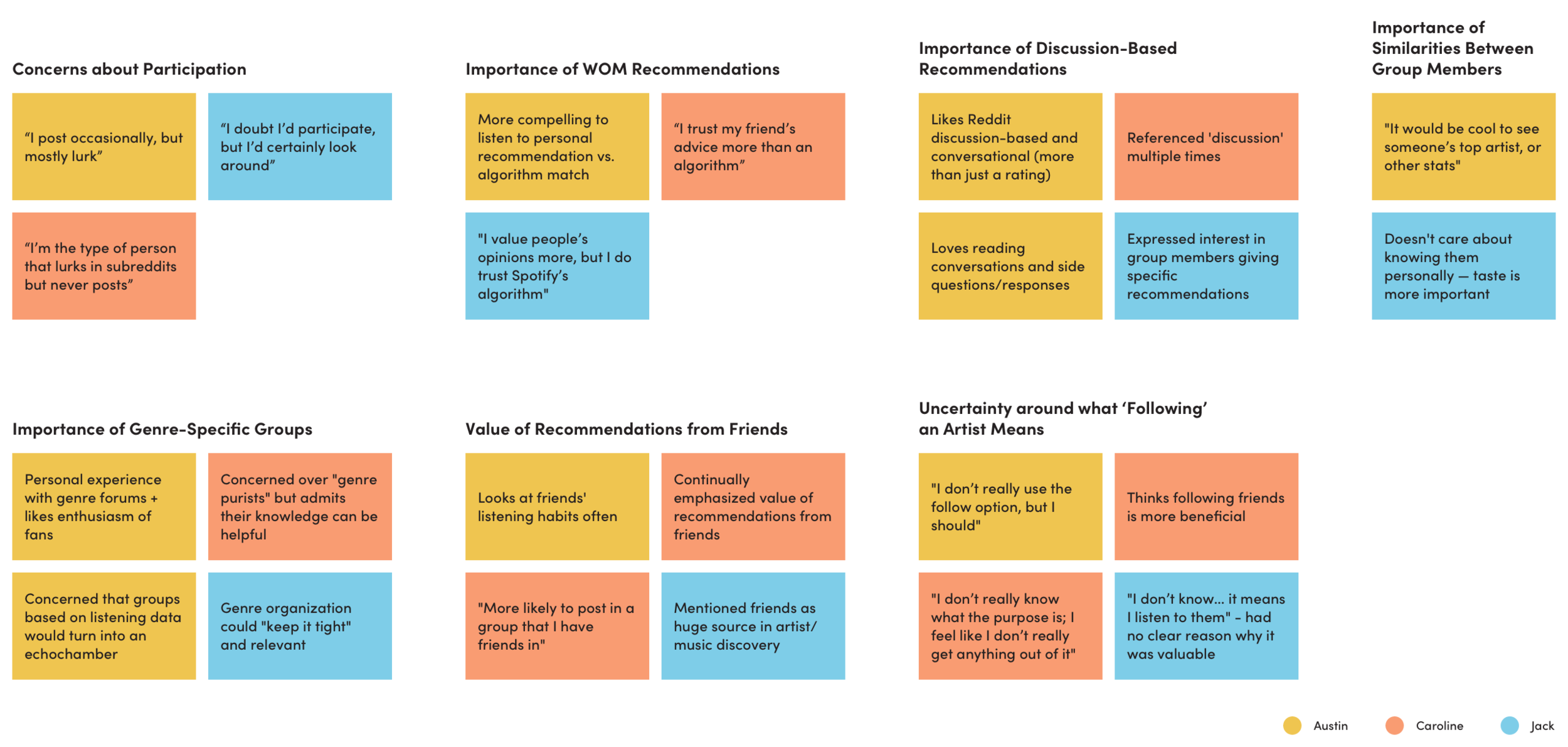
What were the biggest takeaways?
All of them emphasized how much they valued recommendations from friends (or real people) more than an algorithm. All offered personal anecdotes confirming this.
All admitted they’d probably “lurk” without actively participating.
Two users emphasized the value of discussion-based recommendations. The other didn’t mention this specifically, but did say he’d be interested in specific recommendations that people make within a genre group (which implies a forum would exist).
All expressed interest in genre-specific groups, where passionate people can share recommendations for others to see
All expressed interest in curated groups of people they know — said they would be more likely to participate in that setting
Two expressed overt uncertainty around what “following” an artist means; the other didn’t seem to view it as important or beneficial
Affinity Map
Part II: User Flows
Given the limited scope of the of the project, we’ll assume these interviewees represent the larger Spotify user base. (In a real scenario, I’d definitely want to interview users with a much wider age range).
The user flows are based on the assumption that my interview takeaways were accurate and sufficient. I’d expect the user flow to change after multiple rounds of user testing and iterations.
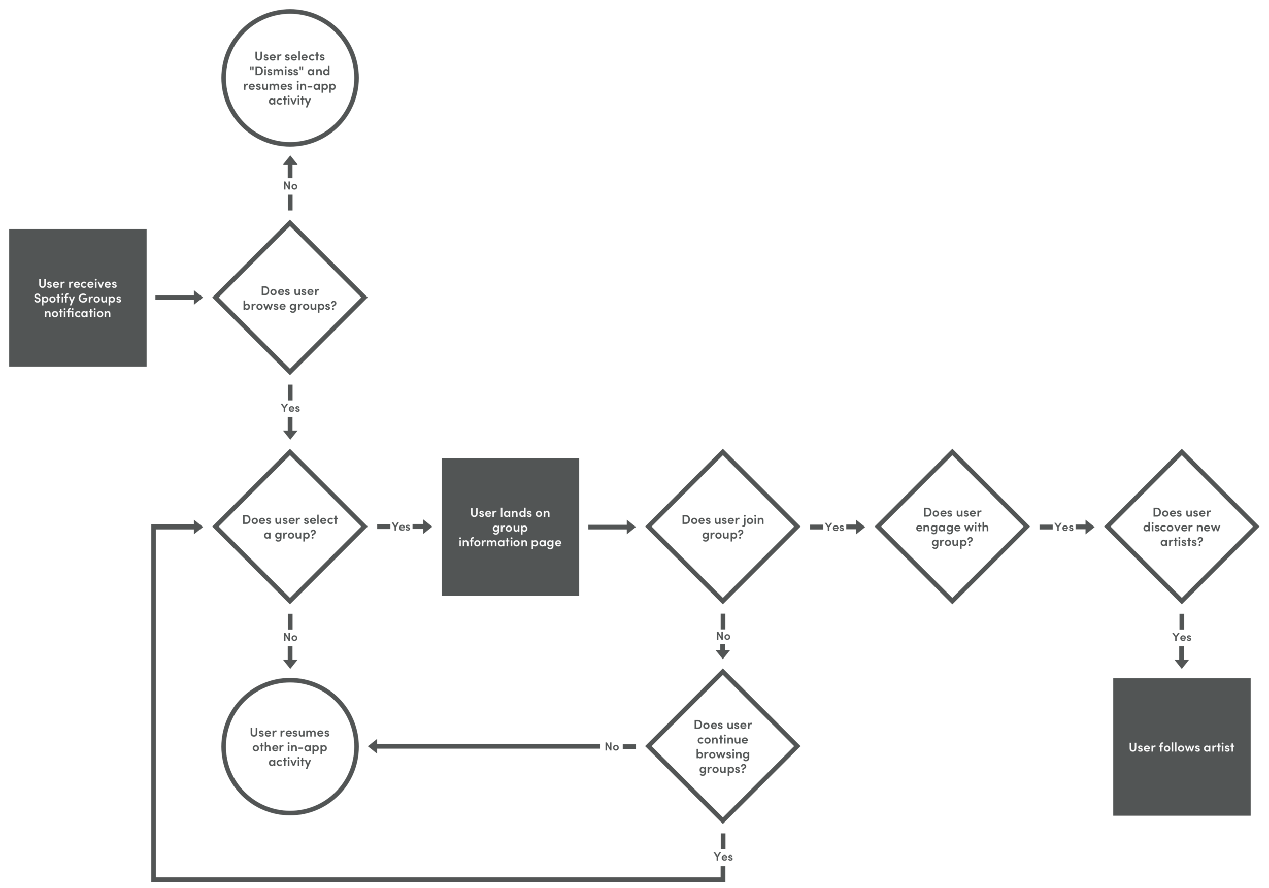
A very high-level overview of the ideal user journey
A more detailed version of the user journey
Part III: Wireframes
Things to Note:
The wireframe below is supposed to be a halfway point between a hand drawing and low-fidelity mockup. I do not assume that any of the screens below represent an “ideal” version. (Scroll down for more on this.)
Based on what I know so far, it seems like the two most important screens are the last two steps in my user journey below. The group home page and forum will likely be the primary drivers of engagement.
Wireframing the User Journey
More thoughts on Wireframes
A lot of the wireframes are influenced by Spotify’s existing app. The context of Spotify’s branding and current app experience were important constraints to be mindful of throughout this process.
Many elements rely on reusable components from other areas of the Spotify app — specifically the first notification, the “Search” experience, as well as the “Fans Also Like” element.
This project is complex, and the user journey may change depending on the scope. In my interview with Caroline, she mentioned how valuable it would be if she had a group of just people she knew. She and Jack also mentioned they would be more likely to participate in that type of setting. If we add that functionality, what does that entail? How does that change the user journey?
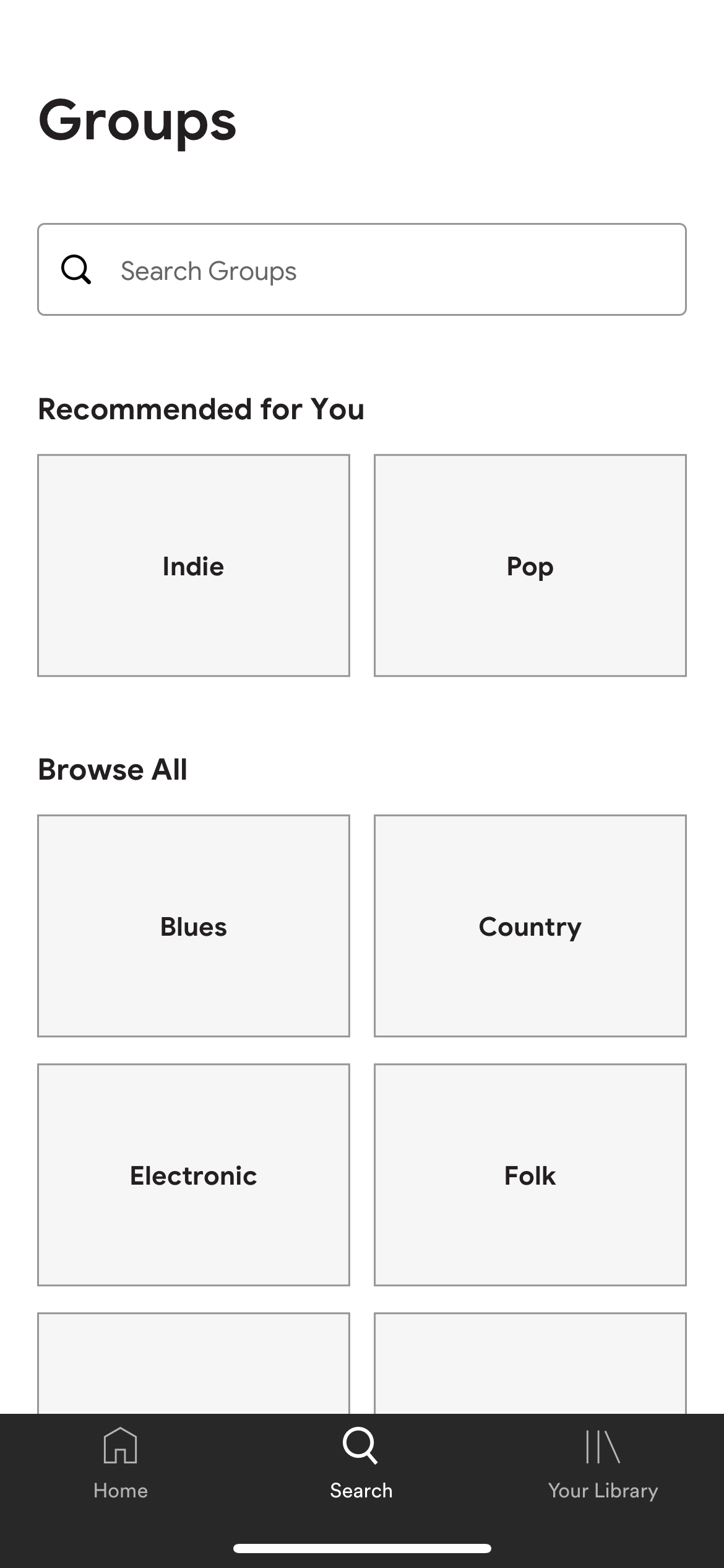
I would think the second screen (with “Recommended for You” and “Browse All”) would have a third and fourth option, allowing users to create their own group or join a group of their friends. This would then turn into a completely different user flow where the user creates or finds a group, and invites friends.
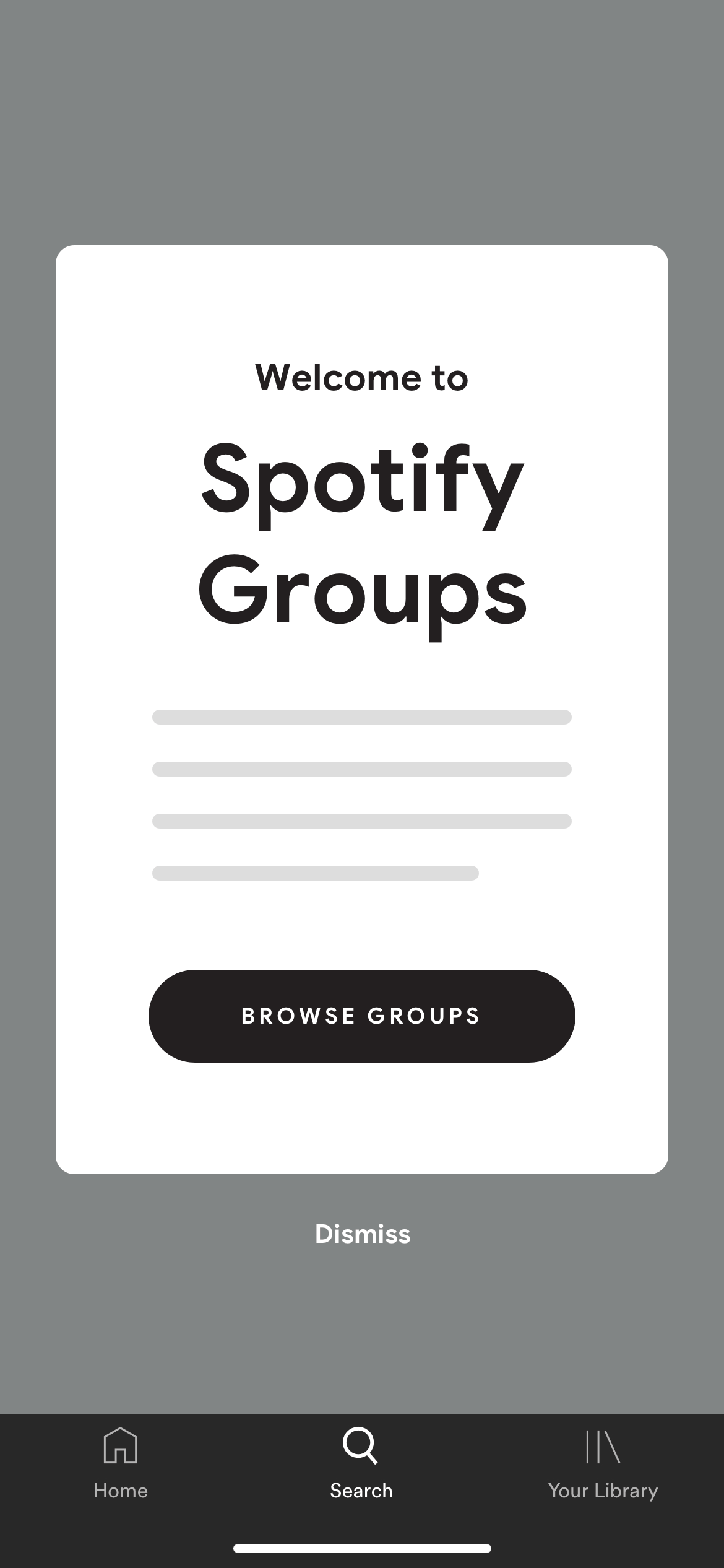
Welcome Screen: Spotify Groups Notification
This is designed to match the current notification system Spotify uses in its app — you can see an example of this design here.
Once the user has interacted with this Welcome screen, the process/user journey will start at a different point — most likely in a more “native” area of the app.
I included an example of where Spotify Groups might live here.
Where else could users enter the Group feature? More on that below.
Groups Main Search Page
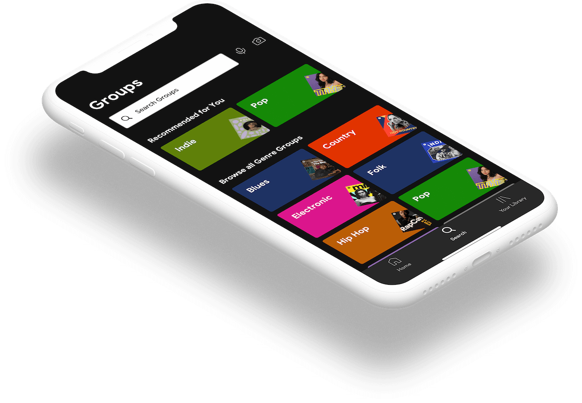
This page is designed to match the current Search page on Spotify — where users can browse through genres to find relevant song and artist recommendations.
I chose to categorize the groups based on genre, which came from user feedback. Again, I’m not sure if this feedback represents most Spotify users, but for the purposes of this project, I assumed it does.
Additional Thoughts + Ideas:
Add a section called “Popular with Friends” so users can see what their peers are members of — might make them more likely to join.
Genre Subtypes Listing
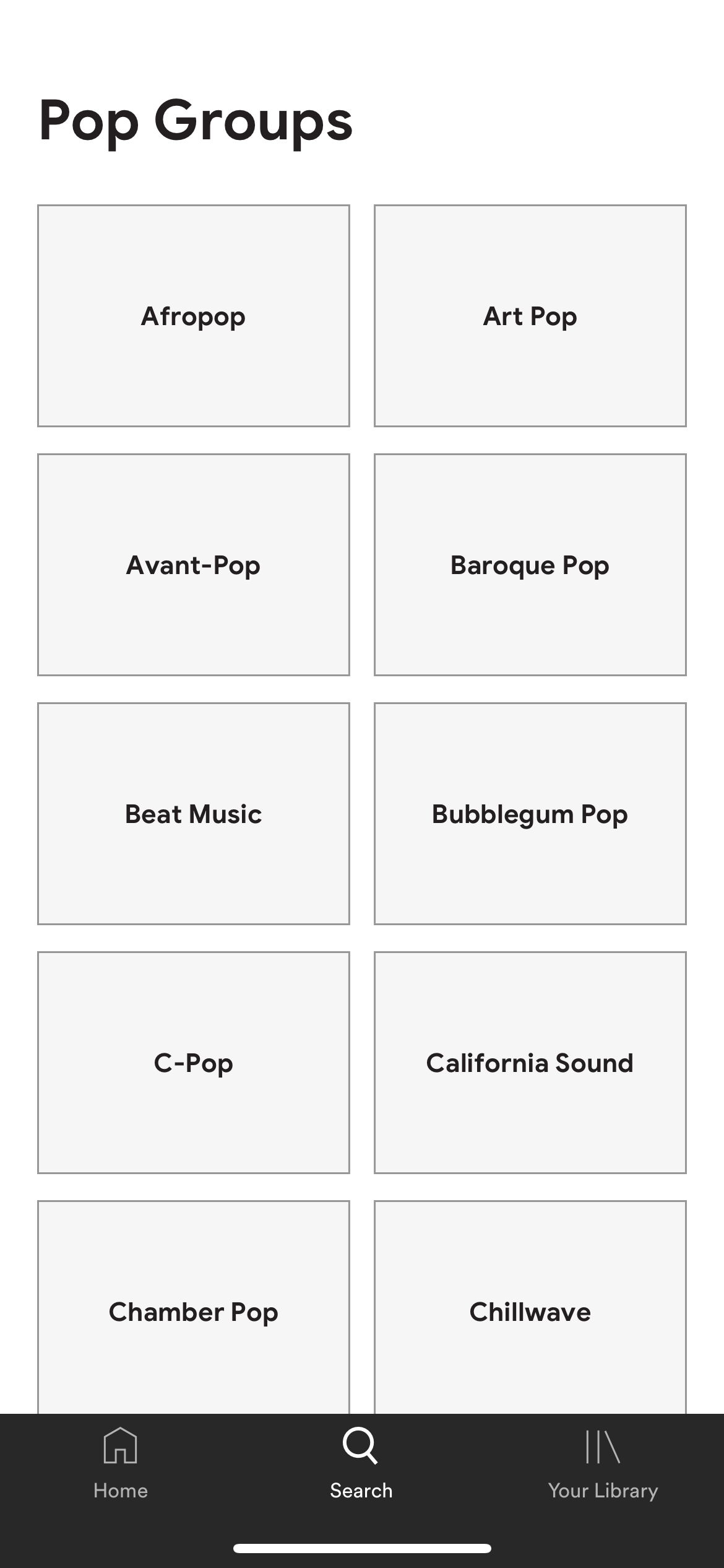
Two of the users I spoke to voiced concerns over group size. My solution at this stage of the process is to break down groups by sub-genre — hopefully narrowing the pool/making the group as relevant as possible to the user.
This screen assumes that we’re in the early stages of Spotify Groups, and that genre subtypes are the only options available. I would assume as the feature becomes more popular, more niche forums will pop up which may significantly alter (and lengthen) this user flow.
If the genre subtype becomes extremely popular… could there be offshoots? Could there be even more specific subtypes within that subtype?
Group Home Page
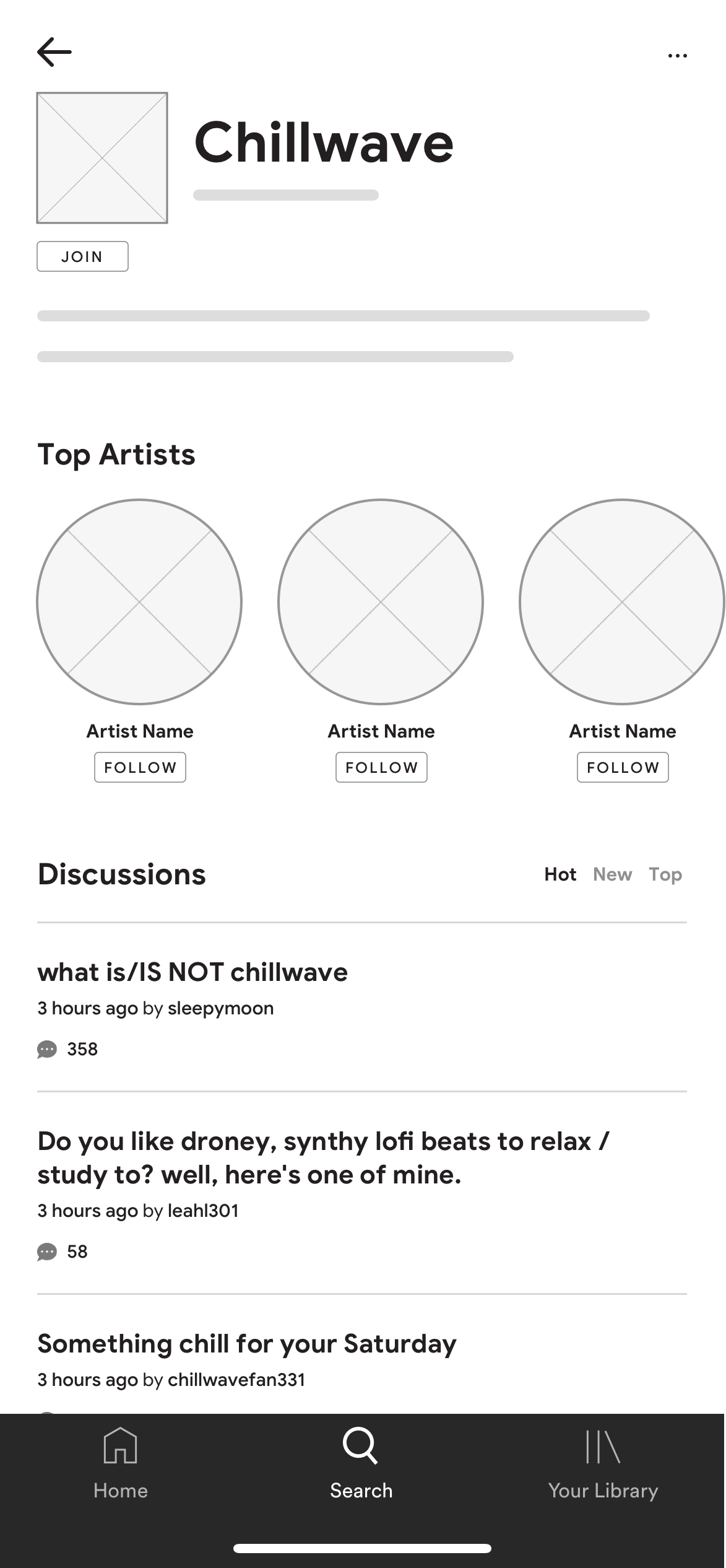
The current hierarchy of information balances user needs and business objectives. It was clear users valued discussion-based recommendations, so that’s a focal point of the screen. However, because Groups are designed to encourage users to follow more artists, the ‘Top Artist” section is featured above. Also, the “Discussions” section is not limited to a handful of featured topics — all remaining discussions appear as the user scrolls down.
The “Top Artists” section was designed to match the “Fans Also Like” section on artist pages. This allows for reusable components and visual consistency.
The “Follow” option below is new, and is specifically designed to make it easier for users to follow artists.
What happens when a user hits ‘Follow’? I expanded on this idea here.
The “Hot” “New” and “Top” filters is borrowed from Reddit. More user testing will reveal what resonates with users, but a system that has been proven to drive engagement and discussions is a great starting point.
One possible issue: If users can create private groups with friends, will these be displayed? Is there any process of vetting members/making them “apply”?
Group Discussion Thread
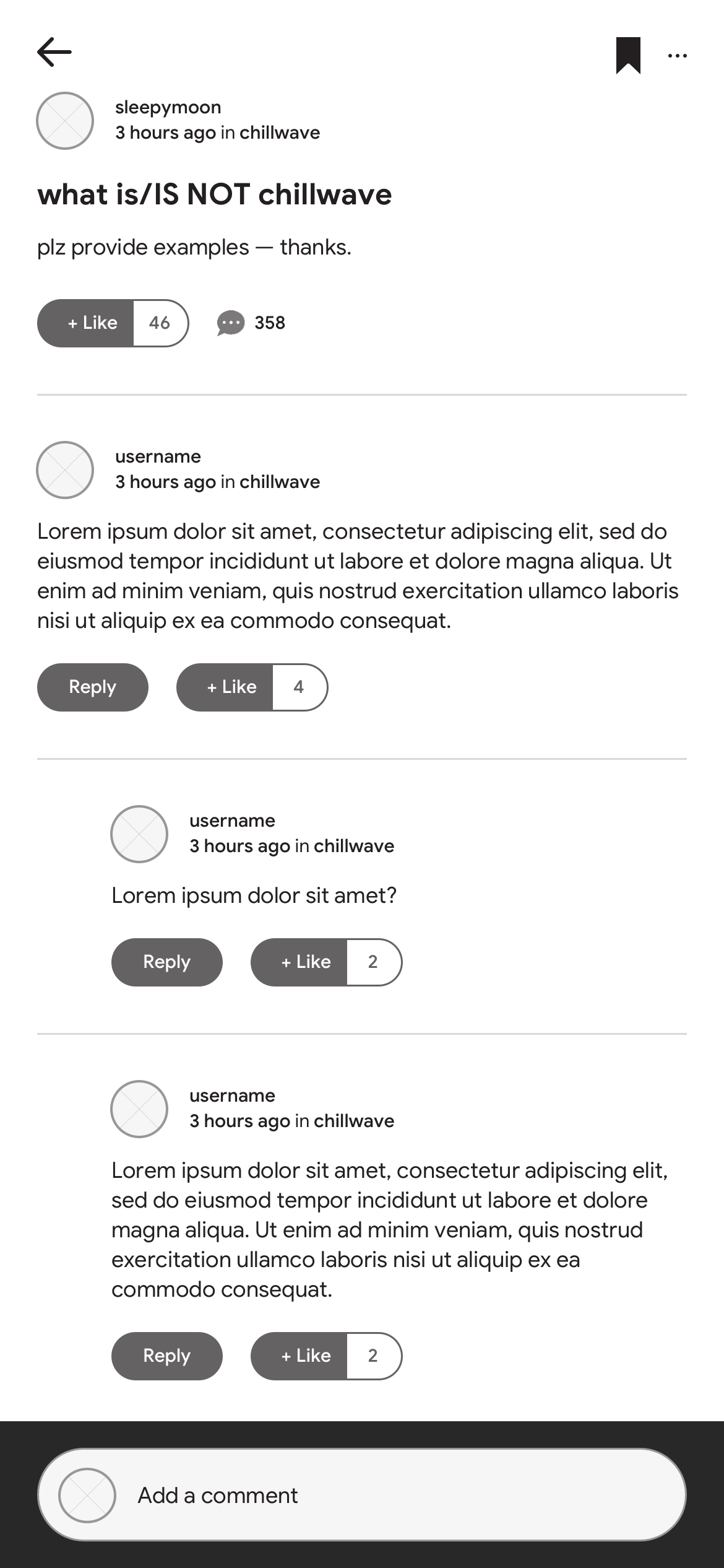
The “Reply” and “Like” functionality is based on Spotify’s current Community site. TBD if it will perform as well on the app (or feel redundant with the “Add a comment” option below). Testing will be key here.
Additional Thoughts + Ideas:
Add a top bar in each thread featuring “Artists Discussed." This could be similar to the “Top Artists” feature in the previous screen, but might also include the number of times the artist is mentioned in the discussion. The “Follow” option would also be present.
Another option is to allow users to hover (or click) over artists mentioned in a discussion. This could either show key artist info (and the ‘Follow’ option) or redirect the user to the artist’s page.
Every interviewee mentioned they would be far more likely to “lurk” than participate. If this is a consistent theme among users, does it have a meaningful impact on engagement/followed artists? If so, how could we incentivize users to participate?
Step IV: High-Fidelity Mockups + Testing Plan
Without user data or clear information around the scope and budget, it’s definitely presumptuous to build high-fidelity mockups. However, I made that leap to show an example of how I’d approach the visual design of Spotify Groups. The goal was to integrate the feature as seamlessly as possible, to match the current app experience.
What would we test? Everything.
Before moving to high-fidelity mockups, I would want to create and test several rounds of prototypes. How do users engage with the app? What features are they most drawn to? Are users who join groups choosing to follow more artists?
If a feature is underperforming, figure out why. Is it an issue with performance (like color or size), or is the feature not resonating with users?
What happens if Groups increase overall engagement, but not the average number of artists each user followers? Would the project still be considered successful?
This is a really important question!
Compare adoption rate metrics to those of other new features in Spotify. If Groups are underperforming, identify why. Is it a positioning or messaging issue? Is the functionality unclear? Are the groups not curated or specific enough?
Recap + Key Takeaways
What elements of your design do you consider absolutely necessary to achieve the goal? If you were asked to de-scope your design, what would you propose and why?
It’s hard to tell this early on… but based on user feedback, I think the Discussion forum is essential to Groups. Without it, the only way to provide relevant suggestions to a Group is through algorithms — which is already a huge part of the app.
I also think artists need to be prominently featured on the main group page and in each discussion thread. This was a mistake in my early mockups. Unless you give users a reason to follow artists (and make it as easy as possible to do so), you should assume their behavior in the app won’t change.
So much of product strategy and design depends on the capacity of the engineering team. In a world of endless engineering and integration opportunities, this feature could be heavily tested and iterated on — resulting in the most creative and relevant experience for users. This is usually not the case, but it can still be an impactful feature nevertheless.
If I had to descope, I’d suggest outsourcing the forum to Spotify’s existing Community page. The results might not be as impactful overall, but they could still make a difference — it would ultimately just come down to marketing the forum in the app.
